We are looking to create the effect where all the titles jump and move around in a distressed way. To make this we had to cut the film into tiny chunks and move them slightly. This worked very well and we nearly finished it by the end of our lesson so we are hoping to finish it by the end of next lesson.
Friday 28 January 2011
28.01.11
We have nearly finished our title sequence. Our two main priorities now are to find music to fit in with our title sequence, this is proving to be harder than we expected as in the second half of the sequence the pace gets faster as the character is running so we are trying to find music that has a faster bit towards the end. The second target we are hoping to achieve by the end of lesson is to make the titles and put them into our title sequence. We have decided to use the same text for the names as the text we used for our title 'Seized'.
Chosen Production logo.

"With each of the previous production logo's we used a white background with black imagery and typography; in this design we used a negative effect to vary our possible options. The typography resembles the different strokes of the feather. In this design we were able to incorporate all the different elements we realised from our first few designs. The contrast of the white on the black creates a softness to the image without losing the sharpness on points of the feather. So far this is the design which we are most likely to use in our opening title sequence as it fits in with the whole look of the sequence."
We chose this for our final production logo as we could easily incorporate this into our title sequence without difficulty as the black background was simple to add in on 'Final Cut pro'.
Wednesday 26 January 2011
26.01.11
Today we have managed to add much more to our title sequence by including our production logo, the Lionsgate opening sequence and our title. Myself and Daisy had the job of starting to look for the music that we are going to include in our title sequence. However, this we proving harder than we originally thought. We had to make sure that the music wasn't too over-dramatic otherwise it would take the originality away from the genre. We don't want this as it will make our title sequence look and sound really cliched.
Monday 24 January 2011
24.01.11
During today's lesson we have furthered our editing process, and updated our blogs. As a group we have decided some bits were best cut out from our original idea. We hope this will make an overall outcome that is better than the original plan.
Friday 21 January 2011
21.01.11
In today's lesson we were re-starting the editing process to our title sequence as all the editing and cutting of clips that I did the other day. So we started doing it again so we began experimenting with the transitions, cutting clips and moving clips around to find the best order of the clips to go in as we haven't really stuck by our storyboard where we think that the clips look better in a different order. For this lesson we were just trying to get used to 'Final Cut Pro' it didn't really matter where we were putting our clips as it was more of a practice. We also focused on updating our blogs. As Sophie wasn't in, myself and Emily focused on the editing of the title sequence whereas Daisy decided to look at things to use in the making of our production logo.
Production Logo.

This is the very first production logo we created, the feather itself has slightly been softened, and the typography we used follows a movement which mirrors the feathers movement. The typography colour has been faded in a way which adds a softness to it again relating make to the feather image. This is not my favourite production logo because it is very basic and there is no dimension to it or fading of colours or graining of the image.

This was the second production logo we designed; from the first design we realised the different elements we had to consider to create a production logo which was the opposite to the first one we designed. Firstly we began by strengthening the dimensions of the feather making it more darker adding further depth to it- which we did not achieve in the original design. Also we added graining over the entire logo this give's an essence of the silent movie era. I thought it would be a good idea to use a typography which resembled an earlier period therefore I chose a font which looked like it had been hand written with ink; the typography also has a motion to it which follows the feathers shapes. A criticism of this design was that the heavy graining could have a harsh effect on the eyes.

By coming to the conclusion that the heavy graining on the image is harsh on the eyes we used a different effect where there is a focal soft point in the middle of the images and the brightness gets darker towards the corners of the production logo.Firstly we began by strengthening the dimensions of the feather making it more darker adding further depth to it- which we did not achieve in the original design- as we did in the previous design.
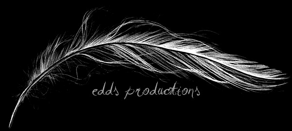
With each of the previous production logo's we used a white background with black imagery and typography; in this design we used a negative effect to vary our possible options. The typography resembles the different strokes of the feather. In this design we were able to incorporate all the different elements we realised from our first few designs. The contrast of the white on the black creates a softness to the image without losing the sharpness on points of the feather. So far this is the design which we are most likely to use in our opening title sequence as it fits in with the whole look of the sequence.

This was our next attempt at a production logo, we had the idea to relate the logo to the genre of our film, so we used a dark ash grey to create a dark mysterious mood to begin the title sequence. As in previous designs we chose to use a typography which mirrors the movement of the feather, as for the colour of the font we chose a slightly lighter version of the grey we had used for the feather- first we used the same colour but found that the writing could sometimes be lost in the background; but by using the lighter colour we were able to make the production name stand out against the black background.

This was our final design for a possible production logo; in previous designs we had used a dark background with lighter imagery. So, in this design we went back to our original design with the lighter background and then chose a varying grey for the feather and writing. We used a soft effect on the image of the feather as we thought it created a pleasant effect as it had done on the first and third designs. As for the typography, we juxtaposed the previous idea of having the font mirror the movement of the feather and chose a sharper type of typography; although bearing this in mind throughout the different letters there are breakages which could show some of the strokes in the feather.
Wednesday 19 January 2011
19.01.11
And.... Action!
 |
| Preparing to film. |
Monday 17 January 2011
17.01.11
Today we decided to do some more filming of the book. We were planning to put these different shots in various places in our title sequence. We thought it would be a good idea to do different angles and shots of the book and slowly panning across it slowly so we can insert the credits onto it when we're in the editing process. As we only had an hour to do this we only had time to upload it to the macs and update our blogs. But I think we are going to leave all the editing once we have finished filming so we know what it looks like all together.
Recently, the weather hasn't been too great so we are hoping the weather is decent on Wednesday because we going trying to stick to our film schedule and don't want it to be raining as we want to film outside the school within our double lesson on wednesday.
Recently, the weather hasn't been too great so we are hoping the weather is decent on Wednesday because we going trying to stick to our film schedule and don't want it to be raining as we want to film outside the school within our double lesson on wednesday.
Friday 14 January 2011
14.01.11
In today's lesson we all went to the library and made sure our blogs were up to date and looked at the tick list and made sure all of our blog posts were satisfactory. For the second lesson we started to film our desk scene - we needed a male character to fulfill the opening scene for our title sequence so we asked if our teacher would like to do it for us. We tried to make our filming as sucessful as possible and tried to keep to our storyboard. The identity of the character remained unknown so we had the lighting from in front of him focusing on the desk and on the book he was looking at. We filmed from behind him and higher than him and slowly zoomed in so the viewers can see what he is actually looking at. By the end of the lesson we had managed to finish all of our filming and just got it uploaded it before the bell.
Next lesson we plan to film more and if we have time do some more editing.
Next lesson we plan to film more and if we have time do some more editing.
The Book.

The Book full of CCTV images.

Pages of CCTV images.

Pages of CCTV images.

Pages of CCTV images.

Pages of CCTV images.

Pages of CCTV images.
Wednesday 12 January 2011
12.01.11
Unfortunately I missed today's lesson due to a Media and Film trip that I went on, learning about the american and British film industry. It was a very useful experience as i learnt a lot from it and it was a brilliant day.
However, without my the girls in my group printed off our CCTV images and decided to make them look like they had been roughly cut out and stuck in the book for the opening scene of our title sequence, they also added the photos to their blogs which I have caught up with.
However, without my the girls in my group printed off our CCTV images and decided to make them look like they had been roughly cut out and stuck in the book for the opening scene of our title sequence, they also added the photos to their blogs which I have caught up with.
Monday 10 January 2011
10.01.11
In today's lesson we updated our blogs, adding whatever we thought we needed, photos, journal etc.
According to our film schedule we were meant to start our filming for our title sequence today but we realised that we didn't have the book we are using as the kidnapper's journal/ scrapbook, so we have had to postpone the start of the filming to Wednesday 12th Jan, which is our next double lesson which should work out better for us as it is a double lesson. However, I personally won't be in that double lesson as I'm attending the media and film trip so i won't be able to partake in the start of the filming but, we have discussed that the girls are only going to film the start of the title sequence which is journal on the desk. This is quite easy to do in school time because we have a choice of classrooms that we can film this bit in.
After school, myself and Daisy stayed behind and took photos of recce, this is photos of the location(s) you are hoping to film in. So, myself and Daisy took photos of the classrooms we are considering to film our opening of our title sequence in. Then, we left the school and photographed the street and garages that are shown in our storyboard. All these photos will be shown on all of our blogs over the next few days.
Photos of the settings we are planning to use.
These photos are ones we have just taken of the locations that we are considering using within our title sequence. Also, we have photographed other possible locations that we could use if others aren't available at the time we plan to film.
Location for desk scene:


The following images are where we have planned to shoot our filming for the stalking scene.
Location for stalking scene:


Finally, these images are where the stalking scene comes to a height of tension and action and where there is a struggle between the man and girl then the camera will fall to a tilt.
Location for struggle scene:


Friday 7 January 2011
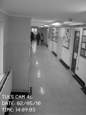
More Surveillance photos.
These are some more images that we decided to take in today's second period.However, we don't think these photos are as good as the ones taken on Wednesday - we were resricted with the space we had to use as it was raining heavily when we went to take the photos so we only had within the school buildings to shoot. So, for these reasons we don't think as a group the photos are as successful as they could have been.


07.01.11
In today's lesson we had an introduction lesson to our new teacher, Mr Purday. So we all explained our plans for our title sequences and what we have put in action so far to start the process of making them, we then started to make a list of what we need to do next so we have all the planning evidence finalised before we start filming. For the second lesson, as a group, we decided it would probably be best to take some more photos as it would be more beneficial if we had a variety of photos to choose from when it comes to adding it in to our 'kidnapper's journal'. After taking the photos we came back to the mac suite and edited to make them look like the surveillance footage, changing the colour, putting the date & time on them and adjusting them. To finish off the lesson we added them onto our blog.
Wednesday 5 January 2011
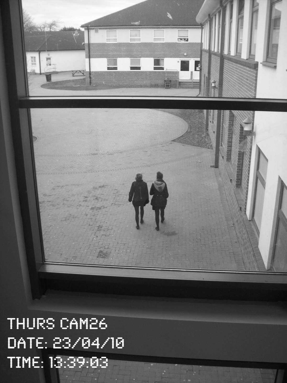
Surveillance Images.
These are all of our images that we have taken and edited. We have tried our best to create CCTV looking cameras and I think our final product for our photos to go in the journal look quite good. Emily and Daisy took on the role of editing and looiked at some real surveillance photos and tried to make them look alike. I am really happy with how they have turned out.


Chosen Images.


05.01.11
Today we were told about the new apple macs and then we all logged onto them in the suite and started to think about what else we needed to finalise before we actually started filming so, Emily created a filming schedule which stated what we needed to have completed by the end of each week in order for us to meet our deadline. Then we all started to upload it onto our blogs and we also added our storyboard onto our blogs. Within the second hour of our double lesson we decided that we should start to take our 'surveillance camera' photos so we left the computer suite and started to take some photos - we tried our best to make them look like CCTV photos by taking them from high angles and zoomed in etc. Finally, towards the end of the lesson we started to edit the photos so they look like they have been taken from CCTV by adding the date and time on them.
Overall, I think in the space of time we took and edited those photos, we done quite well and I am quite happy with our final product, these photos are going to be uploaded onto our blogs and will be used in the kidnapper's journal in our title sequence.
Original surveillance photos - Before Editing Stage.
Here are the original photos that we took for surveillance photos in lesson on 5th January. These photos have been taken to stick in thee kidnapper's journal. These are just the photos we have taken but now we are going on to edit them to make them look more like CCTV camera photos and edit them.


Subscribe to:
Posts (Atom)